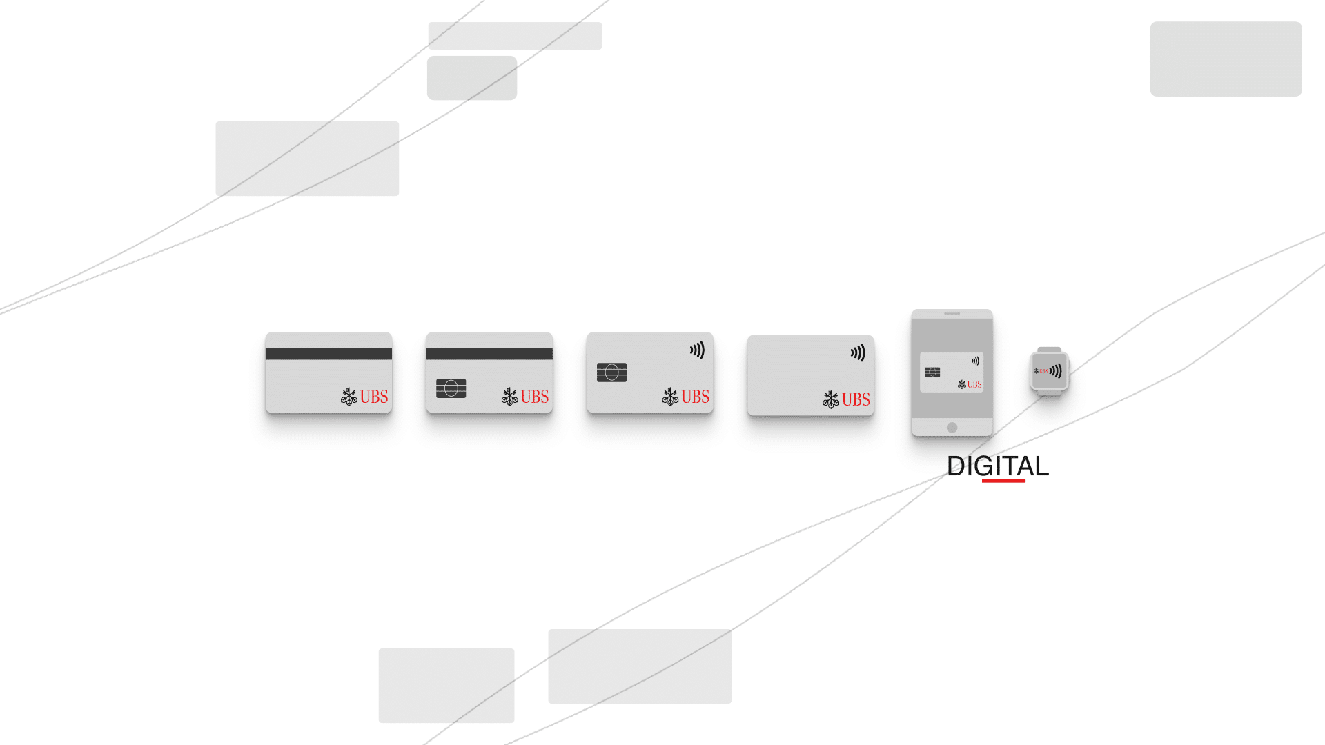
Innovation as a Service campaign
I worked with small and agile Design Team, and I was tasked with preparing a number collateral material for a webinar promo campaign. Campaign was focused on Innovation as a Service in Finance Industry. It featured blog posts with graphical elements / short infographics, small extracts and promos on Twitter and LinkedIn and as a final event – webinar with Q and A panel.
We had a short – just under 3 weeks – deadline to create lots of various supporting collateral material. To make things more efficient on motion side, I created core replaceable and updatable templates and text rigs. Main look was around futuristic UI interface border + glitching effect.


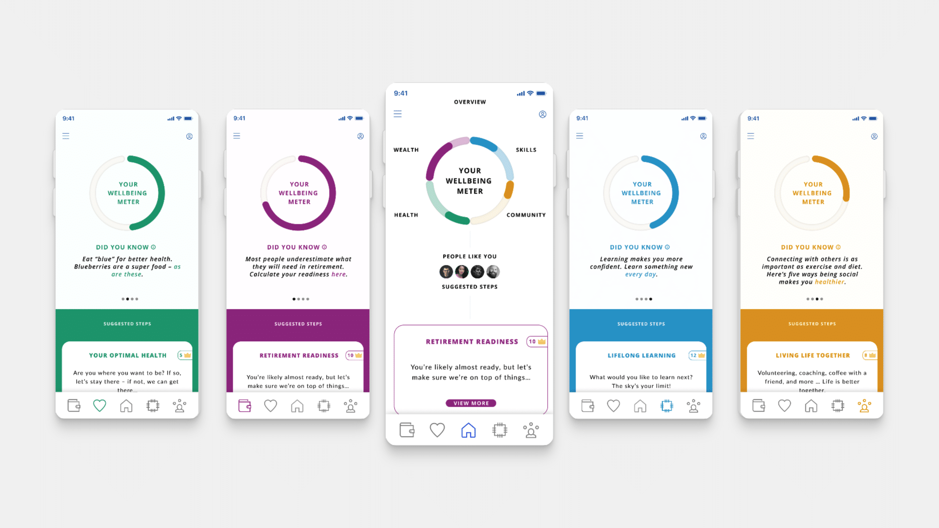
FUI Design and Template
This fake UI was designed to be responsive to content itself, not only to text layer. This way, I was able to reuse it in later scenes of the video, for example by presenting past projects and other artefacts. You can see below how well it adapts to various sized videos, easily without sacrificing render time.
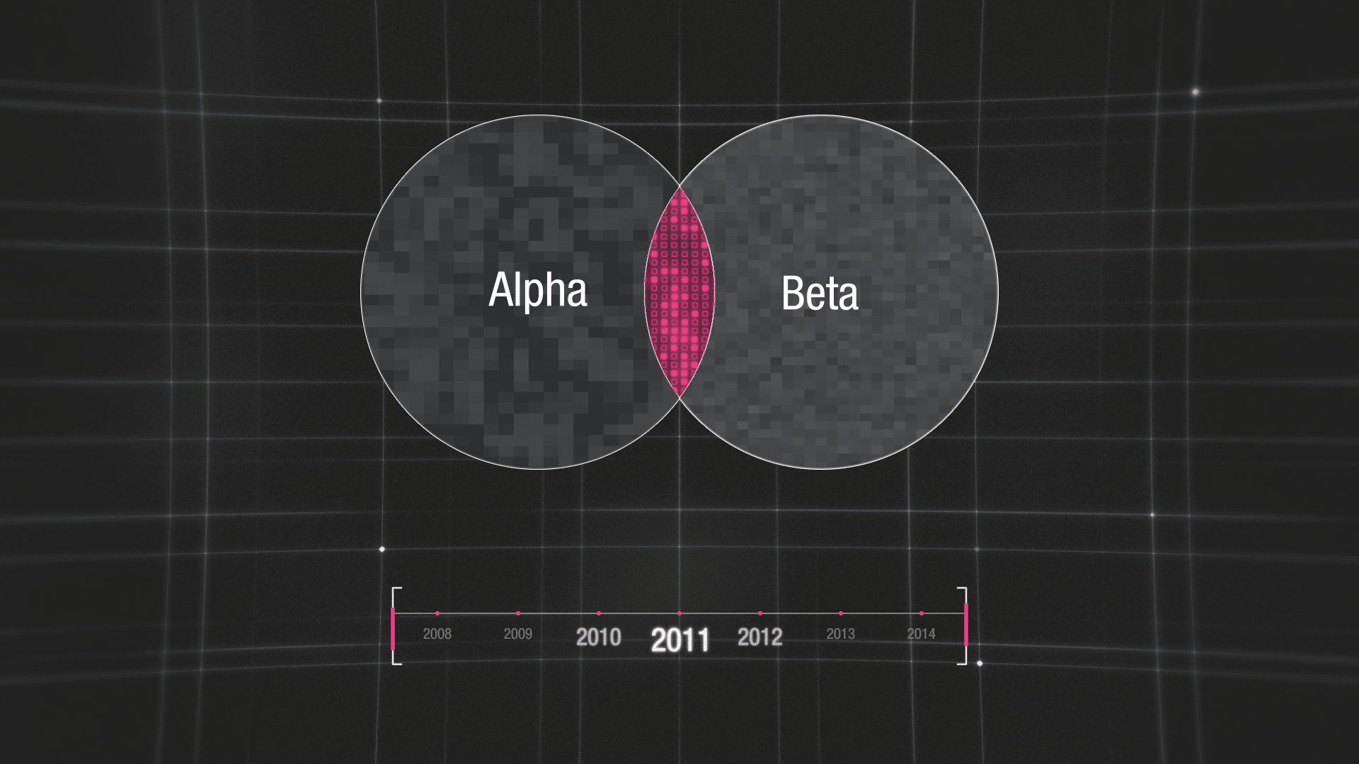
“Force fields” on layers
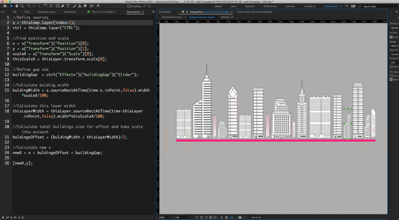
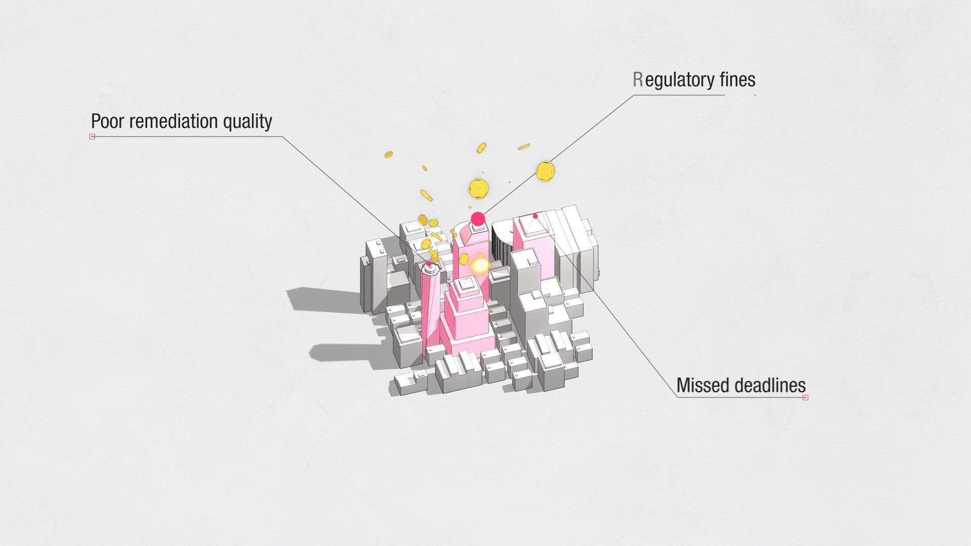
One of my favourite parts of this project, was a “responsive towers” rig. In After Effects, you don’t have option to set some sort of Collision Avoidance or Force Field on each layer or object, like you can in Blender or Cinema 4D. You have to “cheat” it, with expressions.
I created 3 controllers – 1 for each end of the underline and 1 overall for “master position” of all objects. Then I simply wrote a custom expression, with predefined “global margin” between each layer, which would evaluate each building position, as it’s scale changes and scale of neighbour buildings, too.
You can see the code on the right. It looks long, but it is pretty simple, works in real time and reacts to scale of each layer.
If you focus on the big square building in the middle, you will see that all the other objects are “pushing” away from it. This is the secret sauce – it acts as main “anchor” for all the layers. Simply, each layer on the right, is pushing from it’s neighbour on the left towards the centre. And revers on the left side.
Responsive stroke size
The last part of this project, I want to mention are the small details in scale – when you are scaling layers, stroke does not scale proportionally with compositions in After Effects. For example, in Illustrator, you can “preserve” scale and corner size on layers, when you transform them, scale etc. This way, when you design something in X size, you can resize it and stroke won’t be “too big” for smaller size.
To fix this, I used Master Properties and small expression, that links to original stroke. You can see it in the Before / After comparison. By using the custom expression, I can reuse once created asset and resize it, without losing the original look and feel.


Extract from main video
Project Stills


Other Projects