Tutorial 13: Text Smear Effect – Colorama and Details
This tutorial 3rd tutorial from Text Smear series. You can see the other 2 here:
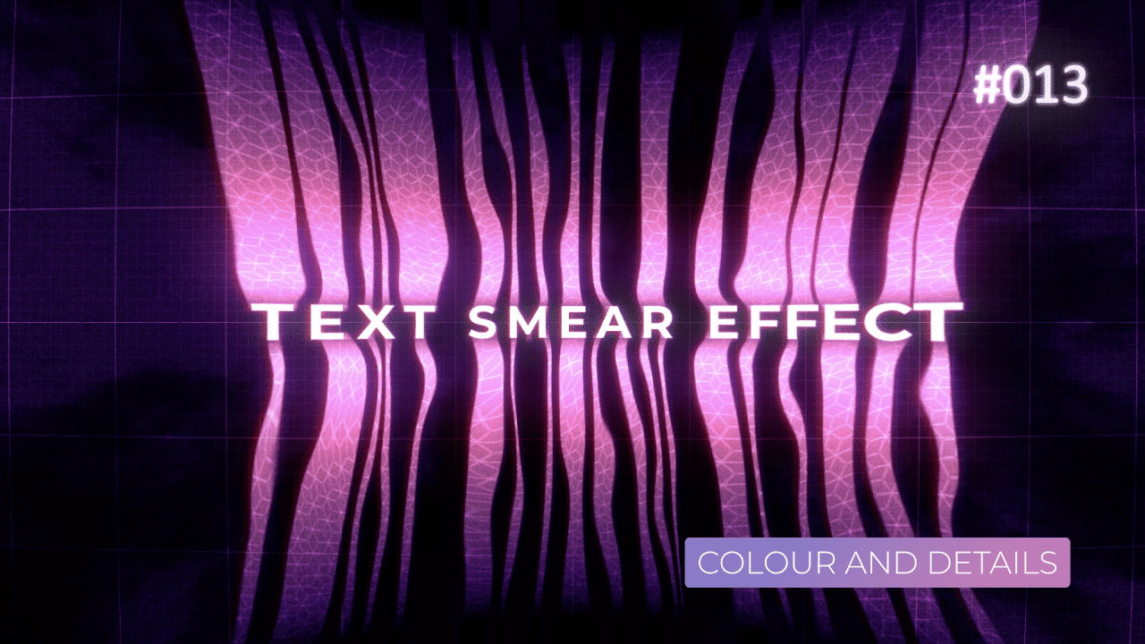
I think this was the most creative from 3 tutorials, but also has a bit of theory and technical thinking behind it. In this tutorial, we will colour black and white image based on brightness values, add details in certain parts and leave others uncovered, add optical distortions, play with blending modes and more.
Colorama
There are not that many expressions in this tutorial. Most of them are pick whip to another property or using time*Number to drive the animation. I will focus on and explain colour effects in this post.
Colorama is the main effect, that decided overall look and tone of the image. It’s pretty complex effect on it’s own, and it is used to colour images, based on various values (Input Phase). In this case, I’m using Lightness (Black and White values), to colour / tint them.
You can easily modify the look and colour with Colour pick – just be aware that for some reason, Colorama has old style colour picker built in.
Last thing is to set blending mode of this layer to Colour. This way, it won’t make the underlying layer brighter / darker. It will only affect colour values.


Shift Channels
Simple effect – it isolates specific channel and you can shift / move it as you wish. I’m adding Fast Box Blur to it, to soften the shift. It makes the layer look like it is glowing slightly. By using Lighter Color as Blending Mode, we are keeping only the brightest parts of the look / image. This way, the effect is subtle and does not overwhelm whole image, like Add Blending Mode would.
Small Hex Grid
This element is made of Grid effect, then CC HexTile with Fold Aligned set as Render option. it creates this 3D cube / Hextile look. By adding Turbulent Displace, we are making less uniform. Finally, Set Matte set to Alpha Channel, let’s us apply this effect only on “smear streaks” areas of the text – areas with pixels on only.
Finally, Classic Color Dodge makes sure that this element is not “too visible” in darkest part of the image. This way, we can blend it better with overall image.


Grain and Noise
This effect “darkens” the whole image, especially when layer is set at Multiply blending mode. What is important, is to set Set Matte effect to Inverted Luminance channel. This way, we are going to target all the dark areas and fade over text slowly. But, leave text in the middle unaffected.


Glow and Optics
This layer does stylisation – adding overall Glow to the whole image and then Distortion, like looking at Magnifying glass.
After Effects basic Glow is pretty ugly. To make it “useful” or better looking, you want to use multiple Glow’s set at various Thresholds / Radius / Intensity. It works best, when you have “biggest” glow first, then you go smaller and smaller.
This way, glows will “add up” and will try to imitate soft neon glow a bit better.
To finish it off, I added Optics Compensation effect to really distort final image.


Final Grid Overlay
Final effect to “tie everything together”. By using Grid effect x2 and linking one to another at 10% value, we can easily have responsive Grid within a Grid. Small styling with colours and you will end up with a semi-futuristic looking screen.
I added Optics Compensation effect as well to this layer to “bend” the grid in different way, than the text is. Because it resizes the actual Grid, you have to add Transform effect to scale it back up to fill the whole composition.


This project file contains all the assets necessary to make animation in the tutorial in final form. Everything is labeled, linked, with expressions and ready to use, if you wish to make your own version or just play around with it.
If you have any suggestions for tutorials or how I can improve, please do get in touch. I would love to hear from you.